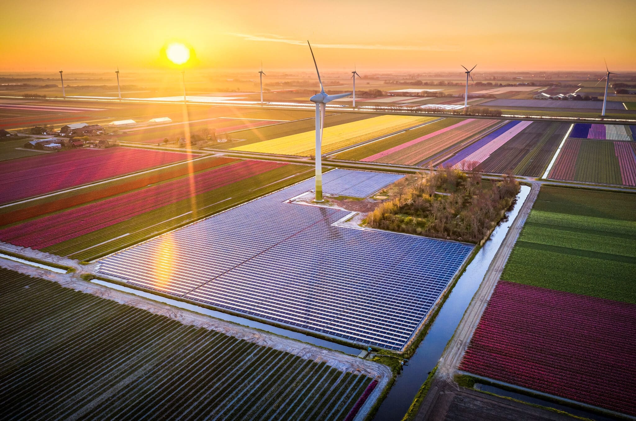
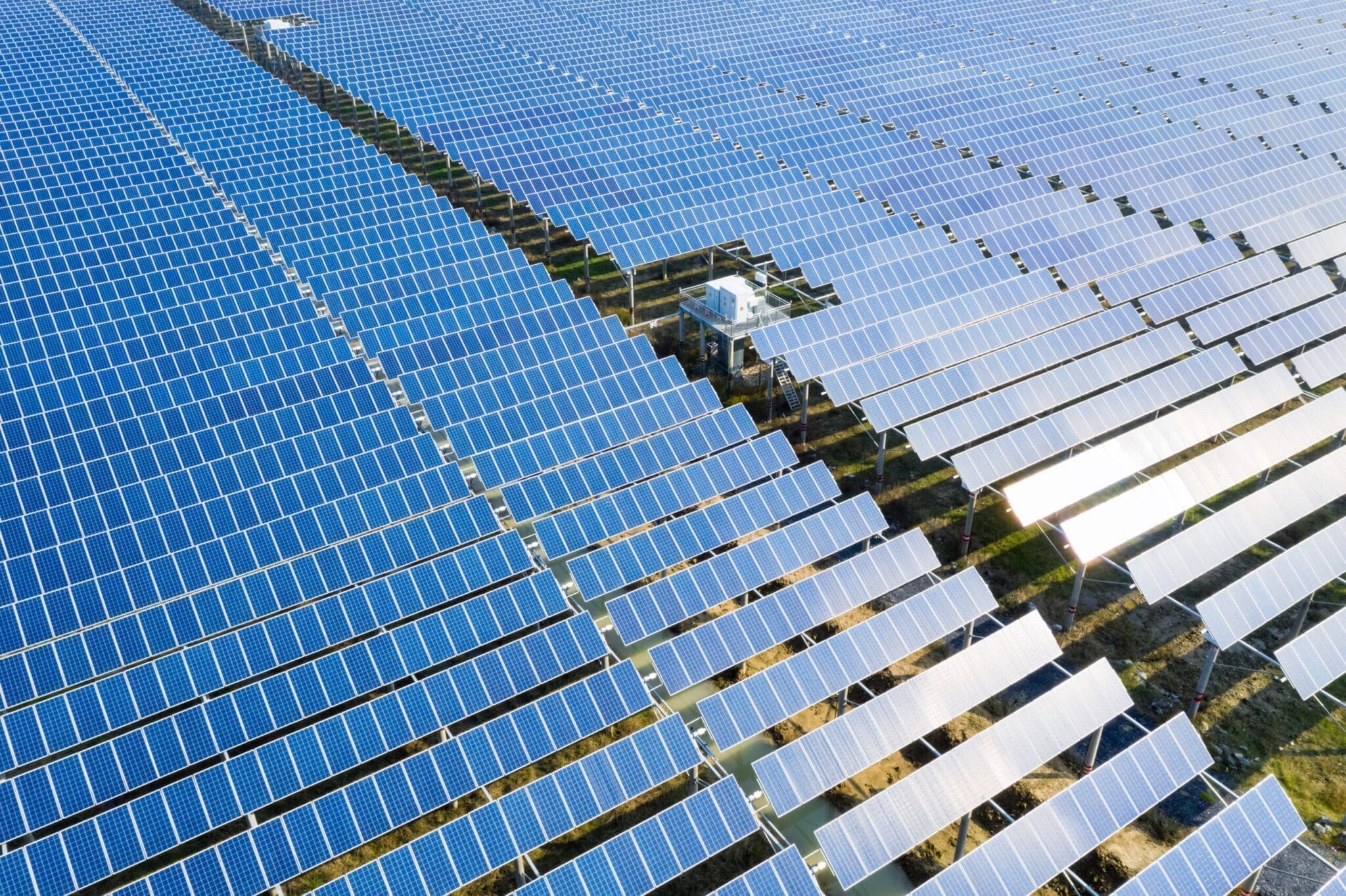
Global Energy
76
Region
All Regions
19,065
Maximise your energy business opportunities
The Achilles Global Energy Network connects major energy buyers with suppliers and enables you to clearly showcase compliance with a wide range of buyer specific criteria and energy industry specific guidance and standards such as NORSOK S006 and IOGP.

Enhanced profiling
Allow buyers to apply their internal benchmarking standards to your profile – giving them an easier way to gauge the suitability of your business.

Certificates
Demonstrate that you meet the requirements of current and potential buyers with your Global Energy network stamp and certificate.

Audits
Demonstrate a higher level of compliance with your potential buyer with Achilles desk and on-site audit options.

We see strong growth among our suppliers that are supported by Achilles.
NETWORK MEMBERS
Put yourself in front of buyers like…
Pricing
Choose the subscription package that suits you
We don’t believe in one size fits all – Global Energy starts from free with a fast-track questionnaire on key company information and the products and services that you offer and scales up depending on the products and services you offer and the type of audit services you require.
Member
Our entry level package – Free to join
Silver
For suppliers that do not offer products or services that are defined as critical by the Global Energy buying community and do not have a European trading address. The Silver option does not include a desktop or on-site audit.
Contact us to discuss pricing options.
Silver Plus
One step up from Silver incorporating the International Association of Oil & Gas Producers (IOGP) Self-Assessment question set.
Contact us to discuss pricing options.
Gold
Designed for companies offering products and services that are classified as critical and have selected a European trading address. Includes a Desktop Audit to meet IOGP423-01 and European operator requirements. Can also be upgraded to an On-site Audit to enhance credentials further.
Contact us to discuss pricing options.

Become a member of the Global Energy Network
Join this NetworkHelp and Support
Global Energy Support Documents
Click on the links to download useful help documents, or visit help site here for more help and support.