Comunidad Global Energy
Industria
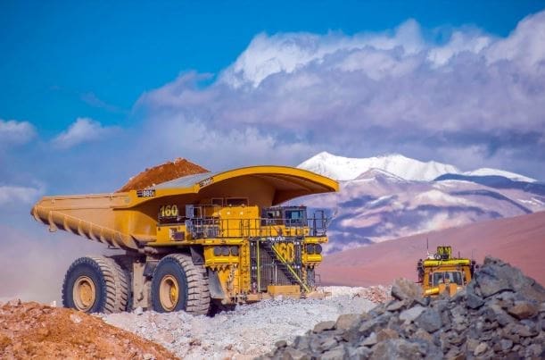
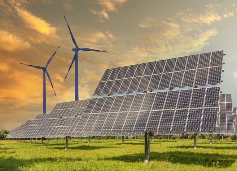
Energía
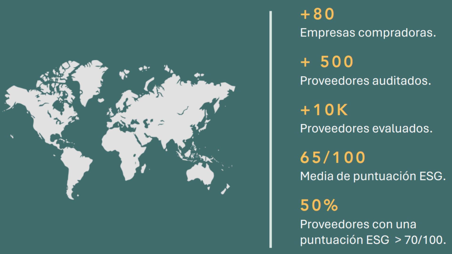
Compradores
76
Región
All Regions
Proveedores
19,065
Maximiza tus oportunidades en el sector energético
La Comunidad Global Energy Achilles es una red que conecta compradores del sector energético con proveedores, ofreciendo herramientas y estándares para asegurar calidad, cumplimiento y transparencia en la cadena de suministro.
¿Qué es Global Energy?
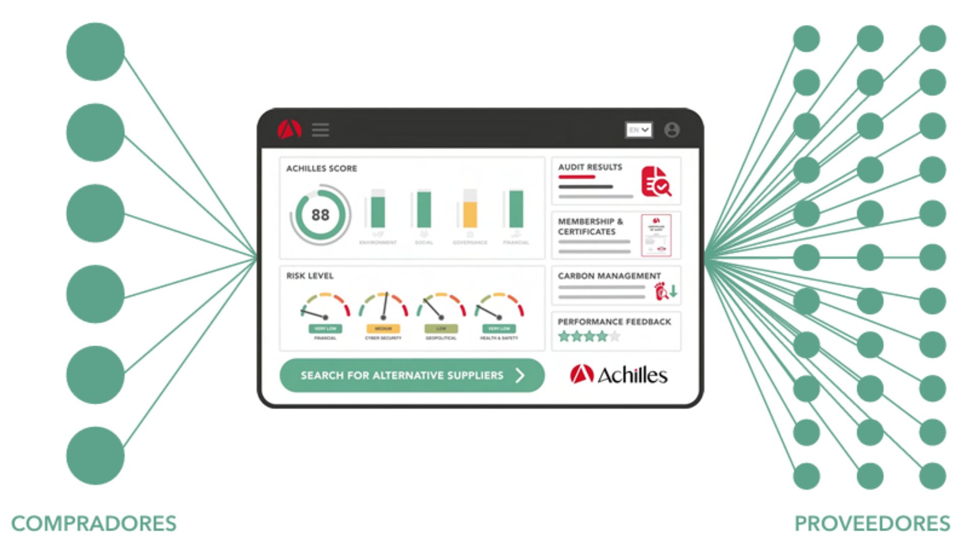
● Plataforma de medición y monitoreo de riesgos de proveedores del sector energía
● +30.000 proveedores calificados en todo el mundo
● +80 empresas compradoras
● La mayor cobertura de proveedores calificados
● Alineamiento con IOPG 423, ISO 20400, ISO 26000, ISO 37001, ISO 37301
● Plataforma AI Enabled
● Verificación de listas restrictivas y noticias adversas
● Verificación de cuenta bancaria de proveedores
● Facilita el cumplimiento de las regulaciones en reporte de Contenido Nacional (SE)
● Incluye la plataforma HORUZ para acelerar su camino a la certificación ISO 37301 (Compliance)
¿Por qué Global Energy?
RED GLOBAL
Formar parte de una red global con más de 80 compradores y
10.000 proveedores activos.
REDUCCIÓN DE RIESGOS REPUTACIONALES Y CONTRACTUALES
Al trabajar solo con proveedores evaluados y verificados, se
minimizan los riesgos de incumplimiento, fraudes o afectaciones a la reputación corporativa.
MEJORA DEL DESEMPEÑO ESG Y SOSTENIBILIDAD
La comunidad facilita el cumplimiento y el reporte de estándares ESG al evaluar y presentar resultados del impacto social y ambiental de tu cadena de suministro.
ESTANDARIZACIÓN Y EFICIENCIA
Tendrás a tu disposición un sistema unificado de evaluación de
proveedores, evitando duplicaciones y procesos manuales. Ahorro de tiempo y recursos en procesos de preselección, homologación y monitoreo.
EVALUACIÓN DE RIESGO Y CUMPLIMIENTO
Achilles realiza validaciones y auditorías (remotas o presenciales) que te permiten conocer el nivel de cumplimiento y riesgo operativo de cada proveedor.
ACCESO A UN REGISTRO VERIFICADO DE PROVEEDORES CONFIABLES
La comunidad reúne a miles de proveedores evaluados con criterios estandarizados. Podrás buscar y seleccionar proveedores que cumplen con requisitos específicos y normativas internacionales como NORSOK S‑006, IOGP, ISO, entre otras.
Novedades
Global Energy ahora en LATAM
En 2025, Achilles realiza en la Ciudad de México el lanzamiento oficial de la Comunidad Global Energy para LATAM, una red que conecta a más de 80 compradores y 10,000 proveedores.
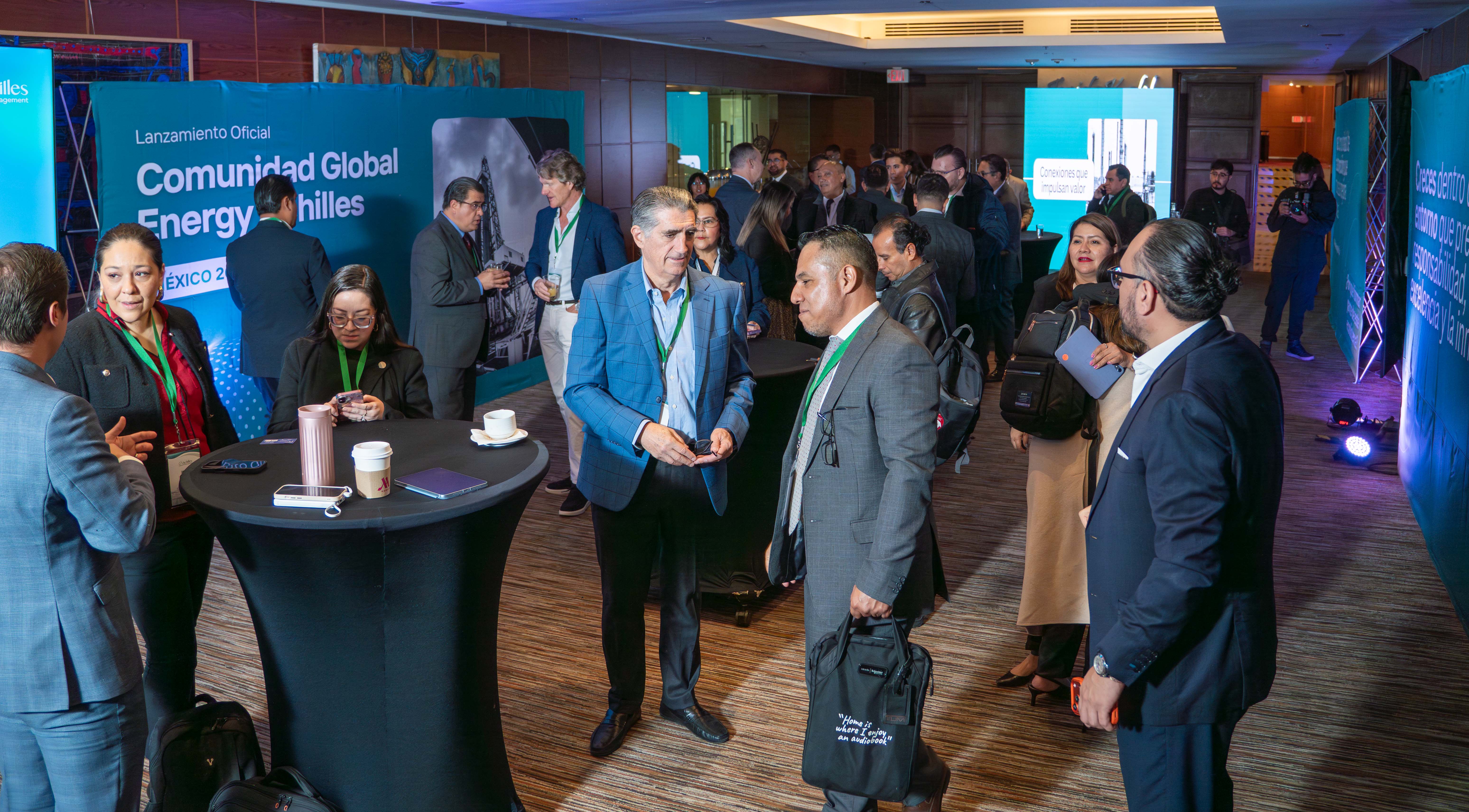
Dicho encuentro reunió arriba de 70 líderes y especialistas del sector energético con un objetivo claro: impulsar cadenas de suministro más seguras, transparentes, sostenibles y competitivas en la región.

El evento ofreció conferencias de alto valor sobre las principales tendencias del mercado energético, una demostración integral de la plataforma y una presentación del impacto estratégico que esta comunidad representa para los compradores y proveedores.
VER LOS MEJORES MOMENTOS DEL LANZAMIENTO
EMPRESAS COMPRADORAS DE LA COMUNIDAD


NIVELES DE SUSCRIPCIÓN
Elige el paquete de suscripción que mejor se adapte a tu modelo de negocio
Ofrecemos distintas opciones de precios, ajustadas al número de productos y servicios que desees habilitar para las búsquedas utilizando tus propios códigos de producto.
Member
Nuestro paquete de nivel de entrada: gratuito para unirse.
Silver
Para proveedores que no ofrecen productos o servicios definidos como críticos por la comunidad de compras de Energía Global. La opción Silver no incluye una auditoría de escritorio ni en el sitio.
Contáctenos para discutir las opciones de precios.
Silver Plus
Un paso más allá de Silver, incorporando el conjunto de preguntas de autoevaluación de la International Association of Oil & Gas Producers (IOGP).
Contáctenos para discutir las opciones de precios.
Gold
Diseñado para empresas que ofrecen productos y servicios clasificados como críticos. Incluye una auditoría de escritorio para cumplir con IOGP423-01 y los requisitos del comprador. También se puede mejorar a una auditoría en el sitio para fortalecer aún más las credenciales.
Contáctenos para discutir las opciones de precios.