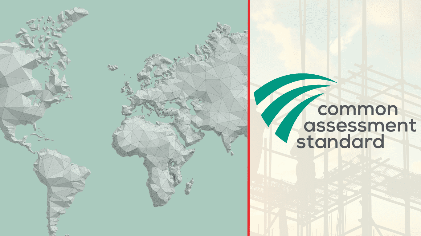
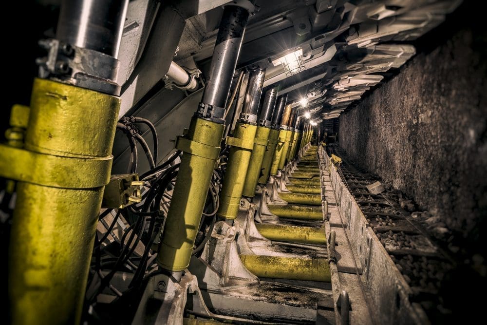
ريجيك – التعدين والأسمنت
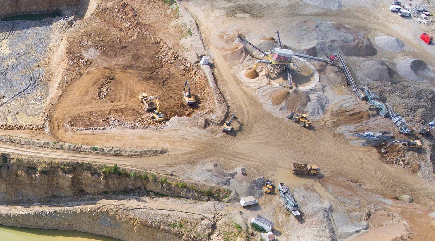
إن هوامش الربح الضئيلة في الصناعة تعني أن كل طن من المنتج مهم لأرباح المشترين والموردين. تحقيق الكفاءة أمر صعب. يجب أن يكون كل من التخطيط والتنبؤ والميزنة والتنفيذ مثاليًا. ومع ازدياد وعي المشترين بالدور الأساسي الذي يلعبه الموردون في تحقيق النجاح، يواصل هذا المجتمع مساعدة الشركات في جميع أنحاء القطاع على تحسين أدائها.
Industry
التعدين والأسمنت
16
المنطقة
جميع المناطق
11954
NETWORK FEATURES
A simpler way to give buyers what they’re looking for – starting with information

Document management
Maintain and manage business-critical supporting documentation such as certificates and policies in one central secure location.

Audits
Demonstrate a higher level of compliance with your potential buyer.

Information specific to buyers
Increase your visibility and appeal to potential buyers by answering all their specific questions.
“For a long time we were looking for a solution, but we never found the right one. The proposal from Achilles responded to the needs and challenges that we were facing.”


NETWORK PRICING
Explore our membership packages
Contact us to find out about our packages and prices.
Help and Support